[범주형 데이터분석] 4. 군집화(Clustering)
by Rev_K-Means 알고리즘
- 데이터 준비
from sklearn.preprocessing import scale
from sklearn.cluster import KMeans

import matplotlib.pyplot as plt

import numpy as np
import pandas as pd
%matplotlib inline
from sklearn.datasets import load_iris
iris = load_iris()iris 데이터로 K-평균 알고리즘을 실습해볼 것이다.
iris.keys()[Out] dict_keys(['data', 'target', 'frame', 'target_names', 'DESCR', 'feature_names', 'filename'])
iris의 key에는 위와 같은 데이터들이 있다.
irisDF = pd.DataFrame(data=iris.data, columns=iris.feature_names)
irisDF.head(3)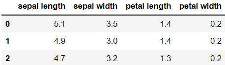
data를 iris 데이터로 지정하고, column을 featrue_names로 지정하여 데이터 프레임을 만드니 위와 같은 데이터를 볼 수 있다.
- K-Means 실행
kmeans = KMeans(n_clusters=3,random_state=0)
kmeans.fit(irisDF)[Out] KMeans(n_clusters=3, random_state=0)
n_clusters=3이란 군집(클러스터)을 3개 만든다는 의미이다.
거기에 irisDF에 fit()를 수행하여 irisDF 데이터에 대한 군집화 수행 결과가 kmeans 객체 변수로 반환되었다.
결과를 확인해보면,
print(kmeans.labels_)[Out] [1 1 1 1 1 1 1 1 1 1 1 1 1 1 1 1 1 1 1 1 1 1 1 1 1 1 1 1 1 1 1 1 1 1 1 1 1 1 1 1 1 1 1 1 1 1 1 1 1 1 0 0 2 0 0 0 0 0 0 0 0 0 0 0 0 0 0 0 0 0 0 0 0 0 0 0 0 2 0 0 0 0 0 0 0 0 0 0 0 0 0 0 0 0 0 0 0 0 0 0 2 0 2 2 2 2 0 2 2 2 2 2 2 0 0 2 2 2 2 0 2 0 2 0 2 2 0 0 2 2 2 2 2 0 2 2 2 2 0 2 2 2 0 2 2 2 0 2 2 0]
군집화는 비지도 학습이지만, iris 데이터는 품종을 나타내는 target 변수도 있기 때문에 분류가 잘 되었는지 알아볼수 있다.
이 숫자는 각각 첫 번째 군집, 두 번째 군집, 세 번째 군집을 의미한다.
np.bincount(kmeans.labels_)[Out] array([62, 50, 38], dtype=int64)
labels_를 각각 세어보니 0은 62개, 1은 50개, 2는 38개가 나왔다.
iris.target[Out] array([0, 0, 0, 0, 0, 0, 0, 0, 0, 0, 0, 0, 0, 0, 0, 0, 0, 0, 0, 0, 0, 0, 0, 0, 0, 0, 0, 0, 0, 0, 0, 0, 0, 0, 0, 0, 0, 0, 0, 0, 0, 0, 0, 0, 0, 0, 0, 0, 0, 0, 1, 1, 1, 1, 1, 1, 1, 1, 1, 1, 1, 1, 1, 1, 1, 1, 1, 1, 1, 1, 1, 1, 1, 1, 1, 1, 1, 1, 1, 1, 1, 1, 1, 1, 1, 1, 1, 1, 1, 1, 1, 1, 1, 1, 1, 1, 1, 1, 1, 1, 2, 2, 2, 2, 2, 2, 2, 2, 2, 2, 2, 2, 2, 2, 2, 2, 2, 2, 2, 2, 2, 2, 2, 2, 2, 2, 2, 2, 2, 2, 2, 2, 2, 2, 2, 2, 2, 2, 2, 2, 2, 2, 2, 2, 2, 2, 2, 2, 2, 2])
기존 target 값은 각각 50개씩이다.
원래 target의 분포는 50:50:50이었지만 군집화 결과는 62:50:38이 되었다.
여기서 target 값과 군집 인덱스는 관련이 없음에 유의하자.
irisDF['target'] = iris.target
irisDF['cluster'] = kmeans.labels_
irisDF.head()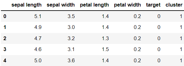
irisDF에 target과 labels값을 각각 컬럼에 추가하였다.
iris_result = irisDF.groupby(['target','cluster']).count()
print(iris_result)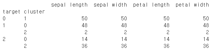
groupby를 이용하여 target과 cluster가 일치하는지 알아보았다.
target = 0인 붓꽃은 모두 1번 cluster로 묶였지만 나머지는 완전히 묶이지 않았다.
kmeans.cluster_centers_[Out] array([[5.91568627, 2.76470588, 4.26470588, 1.33333333, 1.01960784],
[5.006 , 3.428 , 1.462 , 0.246 , 0. ],
[6.62244898, 2.98367347, 5.57346939, 2.03265306, 2. ]])
현재 세 군집에서 피처가 군집의 중심을 기준으로 얼마나 가깝게 위치하고 있는지 cluster_centers_라는 속성으로 알 수 있다. 행은 개별 군집을, 열은 개별 피처를 의미한다.
- 차원 축소 후 데이터시각화
from sklearn.decomposition import PCA
pca = PCA(n_components = 2)
pca_transformed = pca.fit_transform(iris.data)2차원으로 차원 축소를 하려고 한다. (n_components = 2)
pca_transformed에는 새로 찾은 두 개의 주성분 좌표에서 150개의 데이터 위치가 들어있다. (150 X 2 데이터)
irisDF['pca_x'] = pca_transformed[:,0]
irisDF['pca_y'] = pca_transformed[:,1]
irisDF.head(3)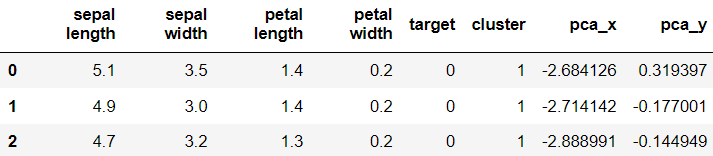
새로 만든 두 개의 pca 데이터를 데이터프레임에 추가해주었다.
marker0_ind = irisDF[irisDF['cluster']==0].index
marker1_ind = irisDF[irisDF['cluster']==1].index
marker2_ind = irisDF[irisDF['cluster']==2].index
plt.scatter(x=irisDF.loc[marker0_ind,'pca_x'], y=irisDF.loc[marker0_ind,'pca_y'],
marker='o')
plt.scatter(x=irisDF.loc[marker1_ind,'pca_x'], y=irisDF.loc[marker1_ind,'pca_y'],
marker='s')
plt.scatter(x=irisDF.loc[marker2_ind,'pca_x'], y=irisDF.loc[marker2_ind,'pca_y'],
marker='^')
plt.xlabel('PCA 1')
plt.ylabel('PCA 2')
plt.title('3 Clusters Visualization by 2 PCA Components')
plt.show()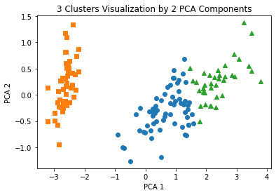
plt.scatter()를 이용하여 산점도를 그려보았다.
- Clustering 알고리즘 테스트를 위한 데이터 생성
sklearn.datasets에 포함되어 있는 make_blobs()를 이용하여 분류와 군집화 알고리즘의 연습을 위하여 인위적인 데이터를 만들 수 있다.
from sklearn.datasets import make_blobs
%matplotlib inline
X, y = make_blobs(n_samples = 200, n_features = 2, centers = 3,
cluster_std = 0.8, random_state = 0)make_blobs()의 파라미터들에 대해 설명하자면,
n_samples는 만들 데이터 수, n_features는 피처 수, centers는 군집 수, cluster_std는 생성될 데이터의 표준편차, random_state는 난수 발생 시드를 의미한다.
print(X.shape, y.shape)X에는 feature 데이터가 들어있고, y에는 target 데이터가 들어있다.
print(X.shape, y.shape)[Out] (200, 2) (200,)
unique, counts = np.unique(y, return_counts = True)
print(unique, counts)[Out] [0 1 2] [67 67 66]
unique() 함수는 변수에 있는 서로 다른 값을 보여준다
200개로 된 y변수(target 값)에는 0, 1, 2 값들이 고르게 들어있다.
clusterDF = pd.DataFrame(data = X, columns = ['ftr1', 'ftr2'])
clusterDF['target'] = y
clusterDF.head(3)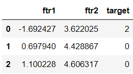
위에서 생성한 두 개의 feature 변수와 target값을 데이터프레임으로 만들었다.
plt.scatter(clusterDF['ftr1'], clusterDF['ftr2'],
c=clusterDF['target'])
plt.show()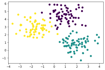
x축을 'ftr1'로 하고 y축을 'ftr2'로 하였다. 색상은 target 변수를 기준으로 나누었다.
target_list = np.unique(y)
markers = ['o', 's', '^', 'P','D','H','x']
for target in target_list:
target_cluster = clusterDF[clusterDF['target'] == target]
plt.scatter(x = target_cluster['ftr1'], y = target_cluster['ftr2'],
edgecolor = 'k', marker = markers[target], label=target)
plt.legend()
plt.show()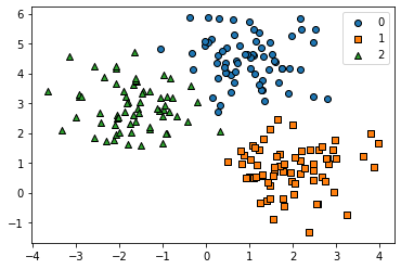
각각 다른 마커로 피처 변수의 그래프를 나타내었다.
kmeans = KMeans(n_clusters = 3, random_state = 0)
kmeans.fit(X) # 분석
cluster_labels = kmeans.predict(X) # 예측
clusterDF['kmeans_label'] = cluster_labels
centers = kmeans.cluster_centers_이 코드에서는 n_clusters에 의해 3개의 군집으로 나누었고,
fit()을 통해 데이터를 분석하고 predict()를 통해 예측하여 분류한 뒤 cluster_labels에 넣었다.
PCA를 했을 때와 다르게 transform() 함수가 사용되지 않았는데,
K-Means에서도 사용할 수 있을까?
X_new = kmeans.transform(X)
X_new[:3][Out] array([[2.80642077, 0.69457301, 4.60739377],
[0.29270428, 2.83452075, 3.83144867],
[0.19394941, 3.27033353, 3.89152913]])
여기서 가장 작은 데이터의 인덱스 값이 선택되어 cluster_labels에 들어가는 것이다.
컬럼이 3개인 이유는 집단을 3개로 나누었기 때문이다.
transform()은 데이터에서 각 군집의 중심점까지의 거리를 계산한다.
cluster_labels[:5]array([1, 0, 0, 1, 0])
centers[Out] array([[ 0.990103 , 4.44666506],
[-1.70636483, 2.92759224],
[ 1.95763312, 0.81041752]])
centers 변수는 kmeans.cluster_centers_로 각 군집의 중심점 좌표를 의미한다.
plt.scatter(X[:,0], X[:,1], c = y)
plt.scatter(centers[:,0], centers[:,1], s = 100, c = "r", edgecolor = 'k')
plt.show()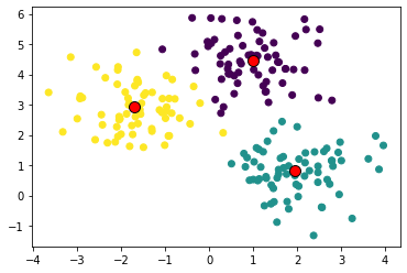
중심점을 그려본다면 위와 같이 그려볼 수 있을 것이다.
unique_labels = np.unique(cluster_labels)
markers = ['o', 's', '^', 'P','D','H','x']
# 레이블이 0번인 데이터는 'o(원)'으로 그림
# 레이블이 1번이면 's(정사각형)', 2번이면 '^(삼각형)'로 그림
# 위에 markers의 인덱스 순서로
for label in unique_labels:
label_cluster = clusterDF[clusterDF['kmeans_label'] == label]
center_x_y = centers[label]
plt.scatter(x = label_cluster['ftr1'], y = label_cluster['ftr2'],
edgecolor = 'k', marker = markers[label])
plt.scatter(x = center_x_y[0], y = center_x_y[1], s = 200, color = 'white',
alpha = 0.9, edgecolor = 'k', marker = markers[label])
plt.scatter(x = center_x_y[0], y = center_x_y[1], s = 70, color = 'k', edgecolor = 'k',
marker = '$%d$' % label)
plt.show()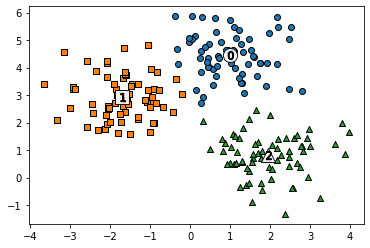
위와 같이 나타낼 수도 있음
지금까지는 군집의 수를 3으로 하여 진행했는데, 이번에는 군집의 수를 5로 설정하여 해보았다.
kmeans = KMeans(n_clusters = 5, random_state = 0)
kmeans.fit(X)
cluster_labels = kmeans.predict(X)
clusterDF['kmeans_label'] = cluster_labels
centers = kmeans.cluster_centers_
unique_labels = np.unique(cluster_labels)
markers = ['o', 's', '^', 'P','D','H','x']
for label in unique_labels:
label_cluster = clusterDF[clusterDF['kmeans_label'] == label]
center_x_y = centers[label]
plt.scatter(x = label_cluster['ftr1'], y = label_cluster['ftr2'],
edgecolor = 'k',
marker = markers[label])
plt.scatter(x = center_x_y[0], y = center_x_y[1], s = 200, color = 'white',
alpha = 0.9, edgecolor = 'k', marker = markers[label])
plt.scatter(x = center_x_y[0], y = center_x_y[1], s = 70, color = 'k',
edgecolor = 'k',
marker = '$%d$' % label)
plt.show()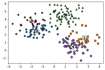
- 로지스틱 회귀에서 predict() 함수는 해당 속성들이 해당 레이블에 속하는지 아닌지를 0또는 1로 구성된 벡터값을 반환해준다.
- PCA에서의 transform()은 fit()에서 저장된 설정값들을 기반으로 데이터를 변환하는 역할을 한다.
- KMeans에서 transform()은 데이터에서 각 군집의 중심점까지의 거리를 계산하는 역할이고, predict()는 가장 가까운 군집의 라벨을 선택하는 역할까지 한다.
군집 평가
군집은 비지도 학습법이므로 그 결과를 평가할 target 데이터가 없다.
군집 결과를 평가하는 방법 중에는 실루엣 분석이 있다. 이는 같은 군집에 속한 데이터끼리의 거리는 짧아야 하고 다른 군집에 있는 데이터 사이의 거리는 멀어야 한다는 것이다.
- 실루엣 분석 (silhouette)
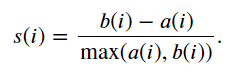
=> a(i) : 자신이 속한 군집에 있는 다른 데이터까지의 평균 거리
=> b(i) : 그 데이터가 속한 군집과 가장 가까운 군집에 있는 데이터까지의 평균 거리
군집화가 잘 되었다면 실루엣 계수는 1에 가까운 값이 될 것이고, 군집 간의 거리가 가까우면 계수값이 0이 될 것이다.
iris 데이터로 클러스터 평가를 해보자.
from sklearn.datasets import load_iris
iris = load_iris()
iris.feature_names = [name[:-5] for name in iris.feature_names]
irisDF = pd.DataFrame(data=iris.data, columns=iris.feature_names)
irisDF.head(3)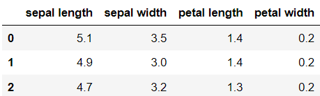
iris의 feature 이름을 컬럼으로 하는 데이터 프레임을 생성했다.
from sklearn.metrics import silhouette_samples, silhouette_score

kmeans = KMeans(n_clusters=3, init='k-means++', max_iter=300,random_state=0)
kmeans.fit(irisDF)

irisDF['cluster'] = kmeans.labels_
irisDF.head(3)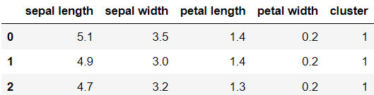
kmeans로 군집화를 실시하였다.
생성된 클러스터를 데이터프레임에 추가해주었다.
이제 silhouette_samples()를 이용하여 150개 데이터 전체의 실루엣 계수를 계산하고 silhouette_score()를 이용하여 평균도 구해보자.
score_samples = silhouette_samples(iris.data, irisDF['cluster'])
average_score = silhouette_score(iris.data, irisDF['cluster'])
irisDF['silhouette_coeff'] = score_samples
irisDF.head(3)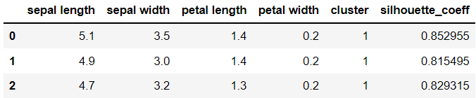
데이터 프레임에 실루엣 계수 컬럼을 추가하였다.
print(average_score)[Out] 0.5528190123564091
irisDF.groupby('cluster')['silhouette_coeff'].mean()[Out] cluster 0 0.417320
1 0.798140
2 0.451105
각 군집별로 groupby 하여 실루엣 계수 평균을 살펴보았다.
1번 군집의 평균은 높은편이고, 0번과 2번은 낮고 비슷한 값을 가지고 있다.
평균이동
평균 이동(Mean Shift)는 K-Means와 마찬가지로 중심점을 계속 이동시켜 군집을 만드는 방법이다.
하지만 다른 점은 k-menas는 데이터의 평균 값을 산출하여 중심점을 이동하지만 Mean Shift는 데이터들의 밀도를 이용한다는 점이다.
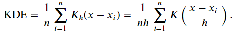
여기서 밀도함수를 추정하기 위해 위와 같은 커널밀도추정(KDE) 방법을 이용한다.
이 식에서 h는 'bandwidth'라고 하는데, 이 값이 너무 크면 과소적합이 발생할 수 있고, 너무 작으면 과대적합이 생길 수도 있다.
시행 과정은 먼저 sklearn.cluster에서 MeanShift를 불러와서 bandwidth값을 지정하고, fit()과 predict()를 돌리면 된다.
import numpy as np
from sklearn.datasets import make_blobs
from sklearn.cluster import MeanShift

X, y  =  make_blobs(n_samples = 200, n_features = 2, centers = 3,
                  cluster_std = 0.7, random_state = 0)

meanshift =  MeanShift(bandwidth = 0.8)
cluster_labels  =  meanshift.fit_predict(X)
np.unique(cluster_labels)
[Out] array([0, 1, 2, 3, 4, 5], dtype=int64)
MeanShift를 수행하였다.
plt.scatter(X[:,0], X[:,1], c=cluster_labels)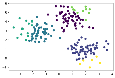
6개의 군집이 만들어졌다. 군집의 개수가 너무 많아 보이기 때문에 군집 수를 줄이기 위하여 bandwidth 값을 높였다.
# bandwidth 값을 높여서 거리를 높임
meanshift =  MeanShift(bandwidth = 1.0)
cluster_labels  =  meanshift.fit_predict(X)
np.unique(cluster_labels)
[Out] array([0, 1, 2], dtype=int64)
plt.scatter(X[:,0], X[:,1], c=cluster_labels)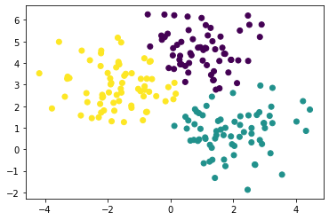
이제는 cluster_std를 조정해보았다.
# cluster_std가 0.3일 때
X, y  =  make_blobs(n_samples = 200, n_features = 2, centers = 3,
                  cluster_std = 0.3, random_state = 0)
plt.scatter(X[:,0], X[:,1], c=cluster_labels)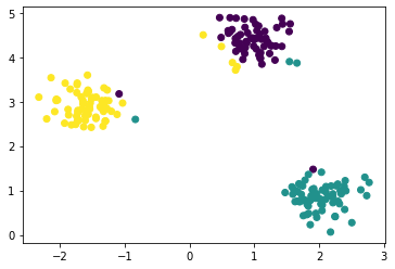
# cluster_std가 0.7일 때
X, y  =  make_blobs(n_samples = 200, n_features = 2, centers = 3,
                  cluster_std = 0.7, random_state = 0)
plt.scatter(X[:,0], X[:,1], c=cluster_labels)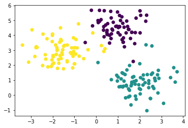
# cluster_std가 1.0일 때
X, y  =  make_blobs(n_samples = 200, n_features = 2, centers = 3,
                  cluster_std = 1.0, random_state = 0)
plt.scatter(X[:,0], X[:,1], c=cluster_labels)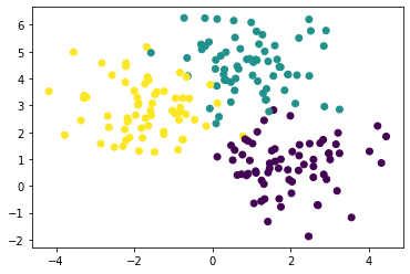
MeanShift에서는 bandwidth 선택이 중요하기 때문에 사이킷런에서는 그 값을 추정하는 함수 estimate_bandwidth()를 제공한다.
from sklearn.cluster import estimate_bandwidth

bandwidth  =  estimate_bandwidth(X)
round(bandwidth,3)
[Out] 1.816
import pandas as pd

clusterDF  =  pd.DataFrame(data = X, columns = ['ftr1', 'ftr2'])
clusterDF['target']  =  y

# best_bandwidth는 세 집단
best_bandwidth  =  estimate_bandwidth(X)
meanshift =  MeanShift(bandwidth = best_bandwidth)
cluster_labels  =  meanshift.fit_predict(X)
np.unique(cluster_labels)
[Out] array([0, 1, 2], dtype=int64)
추정한 bandwidth 값으로 군집하였더니 세 개의 집단이 나왔다.
import matplotlib.pyplot as plt
%matplotlib inline

clusterDF['meanshift_label']   =  cluster_labels
centers  =  meanshift.cluster_centers_
unique_labels  =  np.unique(cluster_labels)
markers = ['o', 's', '^', 'x', '*']

for label in unique_labels:
    label_cluster  =  clusterDF[clusterDF['meanshift_label'] == label]
    center_x_y  =  centers[label]
    # 군집별로 다른 마커로 산점도 적용
    plt.scatter(x = label_cluster['ftr1'], y = label_cluster['ftr2'], edgecolor = 'k', marker = markers[label] )

    # 군집별 중심 표현
    plt.scatter(x = center_x_y[0], y = center_x_y[1], s = 200, color = 'gray', alpha = 0.9, marker = markers[label])
    plt.scatter(x = center_x_y[0], y = center_x_y[1], s = 70, color = 'k', edgecolor = 'k', marker = '$%d$' % label)

plt.show()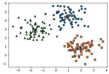
print(clusterDF.groupby('target')['meanshift_label'].value_counts())[Out] target meanshift_label
0 0 67
1 1 67
2 2 66
군집이 잘 되었다.
KMeans에서는 transform()을 사용할 수 있었는데 MeanShift에서는 사용하지 않았다.
그 이유는 transform()은 각 군집의 중심점까지의 거리를 계산하는 역할인데 Mean Shift는 거리 기반 방법이 아닌 데이터들의 밀도를 이용하기 때문이다.
'복수전공' 카테고리의 다른 글
| [표본조사론] 3. 층화임의추출법 (0) | 2021.11.15 |
|---|---|
| [현대사회의 데이터와 통계학] 5. Matplotlib로 그래프 그리기 (0) | 2021.11.10 |
| [데이터 시각화] 6. ggplot2 (0) | 2021.11.04 |
| [현대사회의 데이터와 통계학] 4. Pandas : 구조적 데이터 생성하기 (0) | 2021.11.03 |
| [실험계획법] 중간고사 대비 (0) | 2021.11.01 |
블로그의 정보
Hi Rev
Rev_